Beginner’s guide to candlestick charts.
Being able to identify the most common candlestick reversal patterns gives you an edge in forex.
Being able to identify the most common candlestick reversal patterns gives you an edge in forex.

Price charts and candlestick patterns
Traders use price charts to track and identify historic and real-time price action. Large chart patterns, such as the ‘head and shoulders’ and ‘double bottom’ and candlestick patterns can help traders identify changes in investor sentiment. Here are the most common price chart patterns traders use when trading forex.
Line charts
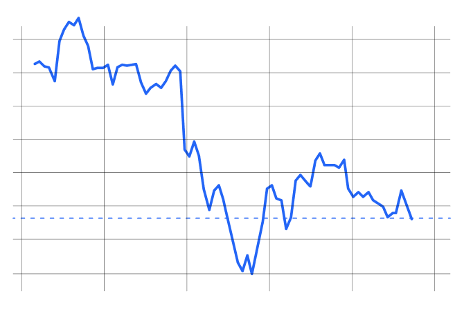
A line chart maps out an instrument’s price movement over time and usually only shows its closing prices over that period. Line charts can be used on any time frame and give you a quick picture of key levels of support and resistance and a sense of an asset’s strength in a simple, illustrated format.
Harami candlesticks
Rice traders in Japan are credited with developing candlestick patterns for trading as far back as the 17th century. In the modern era, understanding candlestick patterns has become an integral component of technical analysis the world over.
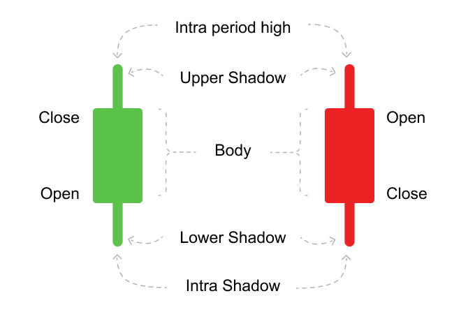
Candlesticks show the open, close, maximum and minimum price for each time frame you are trading in. With a green or bullish candle the top of the candle’s body is the close price. In a bearish or red candle, the close price is at the bottom of the candle’s body.
Open high low close bar (OHLC)
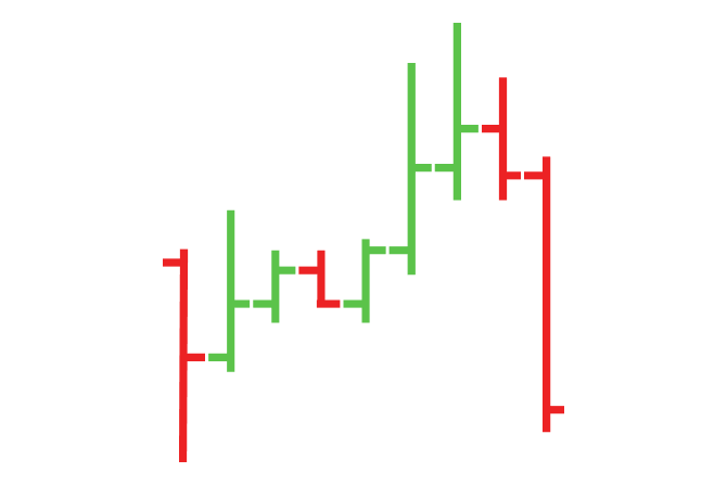
The OHLC is similar to the HLC bar. As well as showing highs and lows for each period and a tick for the closing price, it also provides a horizontal tick to the left to give you the opening mid-price for the timeframe you are looking at.
Heikin-Ashi candlesticks
Meaning ‘average bar’ in Japanese, this is a modified candlestick chart that uses average price data to help filter out market noise and better isolate trends.
How to interpret and analyze candlestick price charts
Candlesticks can pack more information into a single view than any other form of price chart. For this reason, they remain a perennial favorite with many traders.
The body of a candlestick shows the relative change in the open and close rates for the reporting period – the longer the body, the more volatile the swing between the open and close rates.
Reversal candlestick patterns used by experienced traders
There are certain candlestick formations and patterns that warn you a change in market sentiment may be imminent. Candlestick patterns tend to consist of 1 or 2-3 candlesticks appearing side by side on a chart, and these patterns can form bullish or bearish reversal patterns.
Bullish reversal candlestick patterns let you know that the trend in play may be about to change from bearish to bullish. Conversely, bearish reversal patterns indicate the trend may be about to switch from bullish to bearish. Just below, you will find some of the most common reversal candlestick patterns that print on forex charts.
The engulfing candle
When you see a large candle engulfing the previous candle and interrupting the current trend - for example a large bullish candle forming after a smaller bearish candle - there is a high probability that the current trend is about to reverse the other way.
The doji
The doji candlestick signals indecision in the market. Its body is characteristically short, describing a narrow trading range with a tight opening and closing price. When a doji is formed at a point where the market is over-extended or price has run into a resistance level, it can indicate a reversal is imminent.
In a bearish trend, the doji candle typically forms to signal the end of bullish retracement, warning you that price is likely to head lower again. The exact opposite applies if we are in a downward trend and see a bullish candlestick forming - this would indicate there’s a high probability that the bearish trend is about to end and a bullish trend is about to begin.
Hammer or pin bar
In the case of a bullish reversal, we are currently in a downward trend when a bullish candle forms, producing a long shadow (or wick) at its base. This candle pattern signifies a high probability that subsequent candles will be heading back up to form a reverse trend.
The same pattern but in reverse can be seen when a red candle forms a long wick at a major support level, signalling a move down, i.e., a drop in price. This would be called a shooting star, which is the opposite of the hammer.
Hammer and hanging man
Both these candlesticks have long lower shadows (or wicks), small bodies and a small or no upper shadow (or wick). They generally form at points of resistance, which may indicate a reversal of the current trend.
So, if they both look the same, what’s the difference between the two? Simply, the hammer forms at the bottom of a recent downtrend, whereas a hanging man forms at the end of a recent uptrend.
Shooting star or bearish pin bar
This candlestick has a short body and long shadow or wick and tends to form at the end of an upward trend, often with a double-top formation. If there’s confirmation in the form of a second bearish candlestick, there is a high probability the trend has reversed to the downside.
Morning star
A morning star candlestick has a short body and a short but almost equal upper and lower shadow or wick and often forms at the end of a strong trend up or down. Even as it is forming it can wink at you like a star, turning from red to green, warning you of a possible reversal.
Spinning tops
Spinning top candlesticks look just like spinning tops and typically form when momentum is cooling off and the market has arrived at a point of indecision. It is easy to assume these candlesticks indicate a reversal is about to happen, but just as often they form prior to a bigger push in the same direction, so traders often wait for confirmation before opening a trade when they see these types of candlesticks printed on their chart.
Doji candlesticks
The obvious identifier of a doji pattern is that it has a very narrow body, reflecting the fact that the asset’s opening and closing prices are close together. Doji candlesticks have subtle differences, but all of them indicate the arrival of uncertainty and a potential shift in the direction of the market.
Trading doji signals
Long-legged doji
The long-legged doji shows you that the forces of supply and demand are nearing equilibrium and a trend reversal may be about to occur. Very often this moment of stasis is followed by a consolidation period with little clear indication of which way price will move next. On spotting a long-legged doji experienced traders tend to wait for confirmation with a breakout to the upside or downside before opening a position.
Gravestone doji
This is a bearish pattern which is formed when the opening and closing prices of the asset are equal and occur at or near the low of the period. As its name would suggest, the long upper shadow tends to indicate a reversal to the downside is coming.
Neutral doji
The neutral doji forms when the opening and closing prices are virtually equal. They represent a moment of reflection, or even exhaustion of the current trend, the possibility of a reversal, or a period of congestion is about to follow.
Dragonfly
A dragonfly doji warns you of a potential reversal in price; this can be to the downside or upside, and depends on recent price action. If it appears at the end of a downtrend, the dragonfly candlestick may signal a bullish reversal, whereas if it appears in an uptrend, this shows you that price is weakening and the bears are about to take over. In both cases, it is advisable to see which direction the candle following the dragonfly doji is moving in before opening a trade.
How to use candlestick patterns for trading
The candlestick patterns described above don’t just appear on charts of forex pairs - they appear on all charts. Once you’ve begun to recognize them, you can start to read charts with greater accuracy. You’ll also better understand when to enter and when to hang back, waiting for further confirmation before deciding to execute a trade.
Doji candlesticks should always be taken note of, and very often they will signal a reversal in price action, but they are less useful as signposts in ranging markets when support and resistance levels are closer together.
When looking at a candlestick pattern of interest, the experienced trader will assess its potential impact in the context of support and resistance levels, the momentum of the market and, in some cases, fundamentals, by which we mean the news.
Indicators, such as moving averages, can also be useful in helping you to interpret the imminence or strength of a candlestick reversal. Additionally, you could look at momentum using the MACD indicator, for instance, which measures the moving average convergence and divergence of price, or the stochastic oscillator that warns you when the market has entered an overbought or oversold area for the instrument you are planning to trade.
Identifying trends
‘The trend is your friend’, as the saying goes. And many traders, even seasoned traders, prefer to trade with the trend. So, for example, if the trend is up, you only look to buy, even when the market is going down. The reasoning behind this is that the upward trend - until it finishes - is stronger than the brief, downward counter trend, so you don’t want to go against it.
Price rarely moves in a straight line, instead prices move in waves or cycles known as trends.
Financial markets move due to changes in supply (sellers) and demand (buyers).
An overwhelming supply will usually result in a drop in price. Conversely, increased demand will usually result in an increase in price.
Time frames to trade by
Every forex pair you trade will come with charts that show you price action over a certain time frame, typically ranging from the monthly right down to the minute chart. Best practice has proven that you prepare your trade first by looking at the higher time frames to establish the overall direction of the market, working down to the lower time frames for intraday trading, short term or high frequency traders (trading on very low time frame and ticker charts). The lower the timeframe, the more often the candles are printing on your chart.
What are areas of support and resistance?
If you are in an uptrend and price starts to decline, it’s very likely that you have just hit an area of resistance. Resistance levels occur where bullish movement in price has failed on multiple occasions over numerous timeframes, often as far back as months and even years. The more times an upward trend has been defeated at a certain resistance point, the stronger the resistance. Once you have identified major resistance levels on a chart, it can be helpful to draw a horizontal line through them so you can see how frequently they occur. The reverse applies with levels of support: here you are identifying areas that frustrated the short sellers and kept prices from falling beyond a certain point.
In both cases, the strongest support and resistance levels have been established over days, weeks and months. This is why the kinds of resistance and support levels you tend to see on the lower time frames can be weak and need to be checked against the more durable support and resistance levels of the higher time frames. By drawing in key areas of resistance and support on your chart on the higher time frames before you start trading on the lower time frames traders stand a better chance of not running into a stronger counter trend on the higher time frames.
Candlesticks that typically alert you to a reversal in play come in a variety of shapes and sizes, each with its own unique characteristics. It’s a good idea to familiarise yourself with at least half a dozen, including the doji candle, the shooting star or pin bar, the morning star, the hammer and hanging man and spinning top.
In preparing to take a trade, it is good practice to first map out areas of support and resistance and identify key reversal points on the higher time frames (4hr, daily and weekly) where, historically, price tried to break through to the upside but failed (resistance areas), also areas where price failed to break to the downside (support areas). This basic preparation of the charts helps a trader better assess the risk to reward ratio for any given set-up.
Key takeaways
- Price is typically represented by one of four visuals: harami candlesticks, Heiken-Ashi candlesticks, open high close low bars (OHCL) and a simple line graph
- Traders look for reversal candlestick patterns to identify a potential for a change in the current trend, especially as price approaches key levels of support and resistance
- Bullish reversal candlestick patterns indicate the trend in play may be about to change from bearish to bullish
- Bearish reversal patterns indicate the trend may be about to switch from bullish to bearish.
Difference between leveraged and other forms of financial trading.
expand_less expand_moreUse fundamental analysis to your advantage.
expand_less expand_moreHow is technical analysis different from fundamental analysis?
expand_less expand_moreHow to build a robust trading strategy using indicators and oscillators.
expand_less expand_more


